Back

Explore Courses Blog Tutorials Interview Questions
0 votes
2 views
in Machine Learning by (33.1k points)

I have several questions about labeling for clustermap in seaborn. First is it possible to extract the distance values for the hierarchical clustering, and plot the value on the tree structure visualization (maybe only the first three levels)

Here is my example code for creating a clustermap plot:

import pandas as pd

import numpy as np

import seaborn as sns

get_ipython().magic(u'matplotlib inline')

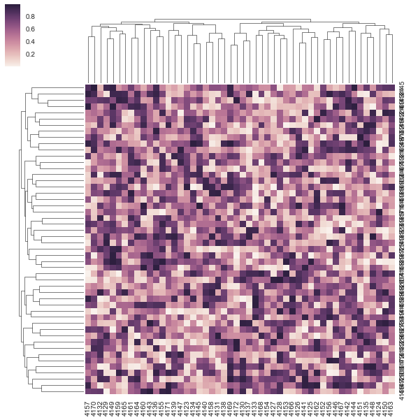
m = np.random.rand(50, 50)

df = pd.DataFrame(m, columns=range(4123, 4173), index=range(4123, 4173))

sns.clustermap(df, metric="correlation")

enter image description here

image

The other two questions are: - How to rotate the y labels since they overlap together.

- How to move the color bar to the bottom or right. (There was a question for the heatmap, but does not work for my case. Also does not address the color bar position)

1 Answer

0 votes
by (33.1k points)

For your case, the issue is that if you do plt.yticks(rotation=0), it will rotate the labels on your colobar due to the way ClusterGrid works. To solve it and rotate the right labels, you need to reference the Axes from the underlying Heatmap and rotate these:

cg = sns.clustermap(df, metric="correlation")

plt.setp(cg.ax_heatmap.yaxis.get_majorticklabels(), rotation=0)

For your second question about the colorbar placement, I don't think this is supported at the moment by any library or API.

For the hierarchical clustering distance values, you can access the linkage matrics for rows or columns with:

cg = sns.clustermap(df, metric="correlation")

cg.dendrogram_col.linkage # linkage matrix for columns

cg.dendrogram_row.linkage # linkage matrix for rows

Hope this answer helps.

If you want to learn Machine Learning then visit this Machine Learning Course by Intellipaat.

Browse Categories

...