You can use Python to visualize your data with Power BI Desktop. As a prerequisite, You need to install Python on your local machine and enable it for Python scripting in Power BI Desktop. You can run python scripts directly in Power BI Desktop and import the resulting datasets into a Power BI Desktop data model.
You can follow these steps in order to create a sample visual in Power BI using Python Script:
Step 1: Run Power BI and load the data source.
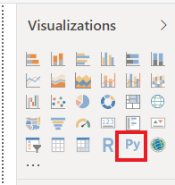
Step 2: Select the Python visual icon in the Visualizations pane.
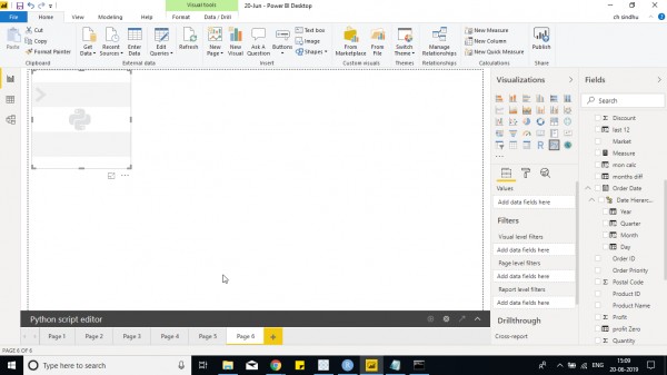
Step 3: Now, Python script visual is displayed on the screen as shown in the screenshot
Step 4: Now go to Python script and select the fields that you want to use in visual.
Step 5: And then install matplotlib in python using pip.
Step 6: In order to create a bar chart, write code as below
import matplotlib.pyplot as plt
plt.bar(dataset.Market,dataset.Sales)
plt.xlabel("Sales")
plt.ylabel("Profit")
plt.show()
In order to create a Scatter chart using Python - You can use below code with different fields as required.
import matplotlib.pyplot as plt
plt.plot(dataset.Sales,dataset.Profit,'go')
plt.xlabel("Sales")
plt.ylabel("Profit")
plt.show()
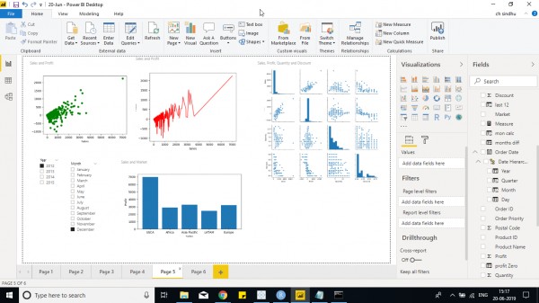
Another example of pair plot that is present on the top right side of the screen with multiple graphs is used to show the correlation of different fields.
import matplotlib.pyplot as plt
import seaborn as ssn
ssn.pairplot(dataset)
plt.show()
In the above 2 Python scripts, within ' ' indicates the type of plot and color such as g,r indicates green and red color for the graph and o,- indicates scatter plot or dashed line chart and combining both you would get a dual axis chart.
So you can play around with plot function and different plots available using format.
Different plot libraries are available in python to use other than matplotlib. One such package is seaborn
Few charts are created by me in Power BI using Python, You can check out them below -
Check out our Power BI Course to have a complete grip on Power BI concepts!