Skewness and kurtosis are crucial statistical measures used to understand the distribution of your data. They provide insights into the shape of the distribution, offering more depth beyond basic metrics like mean, median, and mode. These two concepts are powerful tools for analyzing the symmetry and extremity of your data, and they can significantly enhance your ability to make data-driven decisions. In this comprehensive guide, we will explain skewness and kurtosis, dive into their types, and show you how to calculate them effectively.
What is a Normal Distribution?
A normal distribution is a type of probability distribution that is symmetric around the mean. It’s one of the most fundamental concepts in statistics and data science, often referred to as a “bell curve” due to its characteristic shape.
The normal distribution is defined by two key parameters: the mean and the standard deviation. The mean represents the center of the distribution, and the standard deviation indicates how spread out the data is from the mean. In a perfectly normal distribution, most data points lie near the mean, with fewer data points appearing as you move further away from the center.
1. Key Features of Normal Distribution
- Symmetry: The distribution is perfectly symmetric about the mean.
- Mean = Median = Mode: In a normal distribution, the mean, median, and mode are all equal and lie at the center of the distribution.
- Bell-Shaped Curve: The shape of the distribution is bell-like, with most values clustered around the center, and fewer values found at the extremes.
A real-world example might involve measuring the heights of adult individuals in a population. Most individuals will have a height close to the average, with fewer people being either extremely tall or short.

2. Why is Normal Distribution Important?
The normal distribution is important because many statistical techniques and hypothesis tests assume that data follows this distribution. It serves as the baseline for many analyses and helps define how data behaves in a general sense.
Your Path to AI Engineering Mastery
With the most promising AI Certification Program
What is Kurtosis?
In statistics, kurtosis helps us understand this aspect of a dataset. Think of kurtosis as a way to measure the ‘personality’ of your data, focusing on the tails (the extreme values) and the peak (how tall the data piles up in the middle).
Kurtosis refers to the “tailedness” or the degree of extremity in the tails of a distribution. It provides a measure of how outliers or extreme values appear in your dataset. While variance and standard deviation tell you how spread out the data is, kurtosis tells you how concentrated or dispersed data is in the tails (extreme ends).
1. Key Points to Understand about Kurtosis
- Tails: High kurtosis means that the distribution has heavy tails, indicating that extreme values (outliers) are more likely. Low kurtosis suggests that extreme values are less likely, with a more uniform spread around the mean.
- Peak: High kurtosis also means the distribution has a sharp, narrow peak. Conversely, low kurtosis means a flatter peak.
Kurtosis doesn’t tell you if the data is symmetric or skewed—it just focuses on the extremity and sharpness of the data’s peak. Understanding kurtosis is crucial when you’re analyzing distributions that might have extreme outliers or non-standard data behaviors.
2. Types of Kurtosis
- Leptokurtic: Distributions with high kurtosis. These distributions have heavy tails and a sharp peak, meaning extreme values are more common.
- Mesokurtic: Distributions with normal kurtosis (kurtosis value of 3). These distributions resemble a normal distribution, with moderate tail thickness and peak height.
- Platykurtic: Distributions with low kurtosis. These distributions have lighter tails and a flatter peak, indicating fewer extreme values.
Understanding kurtosis aids in identifying outliers, which is crucial in scientific study, business, and finance when attempting to find abnormalities, evaluate risks, or make forecasts.
Understanding Excess Kurtosis?
Excess kurtosis is a statistic that indicates how much more or less “extreme” your data distribution is when compared to a normal distribution. A normal distribution has a kurtosis of 3, hence excess kurtosis is measured by subtracting 3 from the kurtosis number. This modification facilitates the interpretation of the distribution in relation to the conventional normal curve.
Excess kurtosis = Kurt – 3
1. Understanding the Types of Excess Kurtosis
Excess kurtosis can be Positive (Leptokurtic distribution), Near Zero (Mesokurtic distribution), and Negative (Platykurtic distribution)
- Positive Excess Kurtosis (Leptokurtic Distribution): When excess kurtosis is positive, the distribution has more extreme values (outliers) and a sharper, higher peak.
- Zero Excess Kurtosis (Mesokurtic Distribution): When excess kurtosis is zero, the distribution has characteristics similar to a normal distribution—neither too many nor too few extreme values.
- Negative Excess Kurtosis (Platykurtic Distribution): When excess kurtosis is negative, the distribution has fewer extreme values, and the peak is flatter.
1. Positive (Leptokurtic) or Heavy-Tailed Distribution
Leptokurtic distributions have really long and heavy tails. This means that it’s more common to find unusual values, or outliers, in the data. If the kurtosis value is positive, it tells us that the distribution has a tall peak and the tails at each end are thick. When the kurtosis value is very high, it means that there are a lot of data points in these tails, far away from the average, rather than close to it.
2. Near Zero (Mesokurtic)
Mesokurtic distributions are similar to a normal distribution, meaning their kurtosis value is close to 0. In these distributions, the spread of data is moderate, not too wide or narrow, and the peak of the curve is of medium height, not too tall or too flat.
3. Negative (Platykurtic) or Short-Tailed Distribution
Platykurtic distributions have tails that aren’t too thick and they spread out more around the middle. This means that most of the data points are not too far from the average. When you compare it to a normal distribution, a platykurtic distribution looks flatter and doesn’t peak as sharply.
What is Skewness?
Skewness is a measure that tells us how much a dataset deviates from a normal distribution, which is a perfectly symmetrical bell-shaped curve. In simpler terms, it shows whether the data points tend to cluster more on one side.
Positive skewness indicates that if the distribution’s tail is longer on the right side, we say the data is positively skewed. This means there are a few unusually high values. While in negative skewness, if the tail is longer on the left side, the data is negatively skewed. This indicates a few unusually low values.
If the data for a particular characteristic (like age or income) in your study isn’t evenly spread out and leans more towards one end, this can cause problems. Depending on the method you’re using to analyze your data, this unevenness, called skewness, might break some basic rules of that method or make it harder to understand how important this characteristic really is in your study.
In a skewed data set, the most common values are usually between the first quartile (Q1) and the third quartile (Q3).
Understanding skewness is easier when you consider a normal distribution, where data is evenly spread out. The skewness is zero in such a symmetrical distribution because all the central measures, like the mean and median, are exactly in the middle.
However, what happens when the distribution isn’t symmetrical? In such cases, that data is called asymmetrical, and this is where the concept of skewness comes into play.
Transform Data into Intelligence
Gain Hands-on expertise with Our Expert-Curated Certification
Types of Skewness
There are two types of Skewness applied in the field of data analytics that are elaborated further.
1. Understanding Positively Skewed Distribution
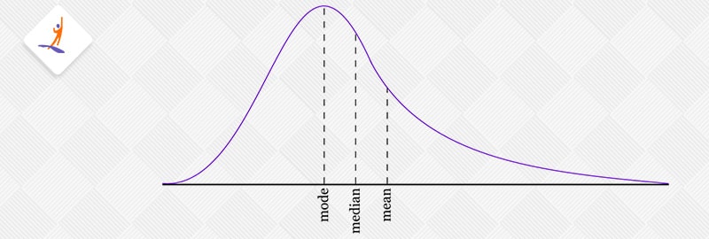
Positive skewness means the data stretches out more towards the right side, kind of like a long tail on the right. This type of distribution is called right-skewed. When you measure this skewness, the number you get is bigger than zero. Imagine looking at a graph of this data: the average (mean) value is usually the highest, followed by the middle value (median), and then the most common value (mode).
So why is this happening?
Well, the answer to this is that, the skewness pulls the data distribution towards the right. This makes the average (mean) larger than the middle value (median) and shifts it to the right. Also, the most common value (mode) is found at the peak of the distribution, which is to the left of the median. As a result, in terms of size, it goes like this: mode < median < mean.
Looking at the boxplot mentioned above, you’ll notice that the second quartile (Q2), which is the median, is closer to the first quartile (Q1). This represents the positive skewed distribution. But what if we have something like this:
In this situation, it was pretty straightforward to identify the skewness in the data. But what if we come across a scenario like the following:
In this example, the distances between Q2 and Q1 and Q3 and Q2 are the same, but the distribution still shows positive skewness. Those with a sharp eye will observe that the right whisker (the line extending from the box) is longer than the left. This longer right whisker indicates that the data is positively skewed.
Therefore, the first step should always be to compare the distances between Q2-Q1 and Q3-Q2. If they are equal, the next thing to check is the length of the whiskers.
2. Understanding Negative Skewed Distribution
As you might have already guessed, a negatively skewed distribution is one where the long tail extends to the left, known as left-skewed. For such distributions, the skewness value is less than zero. As shown in the figure mentioned earlier, in a negatively skewed distribution, the arrangement of central measures follows this pattern: mean < median < mode.
In the boxplot, when we’re looking at negative skewness, the way the quartiles relate to each other can be described as follows:
Similar to what we did earlier, if the difference between Q3 – Q2 and Q2 – Q1 are equal, then our next step is to check the lengths of the whiskers. If the left whisker is longer than the right one, it’s a sign that the data is negatively skewed.
How to Calculate the Skewness Coefficient
Skewness can be calculated through several techniques, with Pearson’s coefficient being the most commonly used method.
1. Pearson’s first coefficient of Skewness
To figure out the skewness, first find the difference between the average value (mean) and the most common value (mode). Then, divide this difference by the standard deviation, which tells you how spread out the data is.
Pearson’s correlation coefficient is a way to measure how two things are related in a straight line, with the value ranging from -1 (they move in opposite directions) to +1 (they move together perfectly). A value of 0 means there’s no straight-line relationship. When we adjust the relationship measure (covariance) by how spread out each thing is (standard deviation), it helps to keep this relationship value between -1 and +1, making it easier to understand.
Now, about Pearson’s first coefficient of skewness, it’s really handy when your data has a clear, most common value (high mode). But if your data doesn’t have a strong most common value, or if it has several, this method might not be the best. That’s where Pearson’s second coefficient of skewness comes in. It’s better in these situations because it doesn’t rely on finding the most common value.
2. Pearson’s second coefficient of Skewness
For Pearson’s second coefficient of skewness, take the mean and subtract the median, multiply this result by 3, and then divide it by the standard deviation.
Rule of thumb:
If the skewness value falls between -0.5 and 0.5, the data is almost symmetrical. When the skewness is between -1 and -0.5 (indicating a negative skew) or between 0.5 and 1 (indicating a positive skew), the data is somewhat skewed. If the skewness is less than -1 (showing a strong negative skew) or more than 1 (showing a strong positive skew), the data is highly skewed.
Get 100% Hike!
Master Most in Demand Skills Now!
Conclusion
In this article, we’ve discussed the concepts of kurtosis and skewness extensively. We gained a knowledge on how skewness and kurtosis has their own effects on the data distribution. All this knowledge is super useful for understanding how data behaves, which is really important in many areas like science, business, and more. If you want to know more about these interesting concept, please check out the Data Science Course.
Check out related Tutorials & Tools blogs-
Frequently Asked Questions
What is the simple difference between kurtosis and skewness?
Skewness measures the asymmetrical nature of a distribution, while kurtosis measures the thickness of a distribution’s tails in comparison to a normal distribution.
What is a normal kurtosis and skewness?
For kurtosis, a value of 3 represents a normal distribution. Excess kurtosis above 3 indicates heavier tails and a sharper peak (leptokurtic), while values below 3 imply lighter tails and a flatter peak (platykurtic).
Why do we calculate kurtosis?
Kurtosis is calculated to understand the shape of a probability distribution. It helps assess the tail and peak of the distribution. High kurtosis indicates heavy tails, meaning extreme values are more likely, while low kurtosis suggests light tails and a more spread-out distribution. Analyzing kurtosis is useful in various fields, such as finance, statistics, and risk assessment, to better comprehend the characteristics of data distribution.
Is kurtosis a measure of shape?
Yes, kurtosis is a measure of the shape of a probability distribution, it specifically assesses the tail and peak of the distribution, providing information about whether the data is heavier. High kurtosis indicates a distribution with heavier tails and a sharper peak, while low kurtosis suggests lighter tails and a flatter peak
What is the shape of a data distribution?
The shape of data distribution can be symmetrical, skewed (left or right), uniform, bimodal (two peaks), or multimodal (more than two peaks). It reflects how the data is spread or clustered, providing its characteristics and techniques.