Now, let us have a glance at the topics and concepts covered in this blog on R for Data Science:
If you are a beginner in Data Science, then start your journey with this Data Science Course:
What is R?
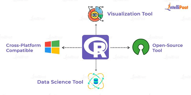
R is a programming language extensively developed for Data Analytics. It is used for statistical analysis, visualization of data, and finding insights in Data Analytics. Also, R programming proves to be helpful for creating Machine Learning models. Further, it proves to be very beneficial while creating projects on R for Data Science.
There are various packages and libraries in R that help create great visualizations for understanding the patterns in data. Also, there are various fields where the applications of R for Data Science play a major role such as IT industry, banking and finance, media and entertainment, healthcare, and many more. Now, let us understand why we use R for Data Science.
Why do we use R for Data Science?
Nowadays, as Data Science is in great demand, the need for a Data Scientist has simultaneously increased in the analytics industry. Besides, one of the widely used tools for Data Analytics is the R programming language. It consists of more than 10,000 packages that help us perform statistical analysis, visualization, data manipulation, exploratory data analysis (EDA), and building Machine Learning models. Also, R is an easy programming language that allows us to efficiently work on various techniques of Data Science.
Now, let us look at some of its features:
- R helps in solving complex real-world problems through statistical analysis and modeling.
- It provides the facility for the customization of libraries and packages. Developers can easily create libraries and packages in R as per their requirements.
- R provides several tools for statistical analysis. For this reason, it is majorly used in the field of research and development.
- R is the best language for data wrangling as it consists of preprocessed packages.
- The ggplot2 package in R helps in smartly visualizing data. It is one of the popular packages used in the Data Science industry for data visualization.
Other than in data manipulation,
visualization, and wrangling, R helps in building Machine Learning models as
well. There are numerous libraries and packages for building models of
regression, classification, clustering, etc. Its wide
range of applications in every field makes it the best programming language of
the day.
In the Data Science use case we have used in this blog, we will work on the ‘US pollution’ dataset documented by US EPA for the years 2000–2016. It consists of 28 fields, along with four main pollutants (Ozone, Carbon Monoxide, Nitrogen Dioxide, and Sulphur Dioxide), for which we will be visualizing the dataset.
Problem Statement for US Pollution Dataset
Here is the US pollution dataset from which we have to understand the trends of the Air Quality Index for SO2, CO, and CO. Also, we will implement Machine Learning algorithms such as linear regression, logistic regression, multiple logistic regression, and k-means clustering.
Let us first load the dataset using the read.csv method. For this, use the path where you have saved the US pollution dataset.
p_data<-read.csv("C:/Users/Intellipaat-Team/Documents/R for Data //Science/pollution_dataset.csv")
Now, we will have a look at the data and will try to
understand the variables.
View(p_data)
Now, we will have a look at the first six values of the
dataset using the head function.
head(p_data)
Data Visualization
Next, in this R for Data Science blog, we will load the ‘ggplot2’ package that we will use later for data visualization. Then, we will load then ‘readr’ package to read the CSV files. Also, we will use ‘TSA’ and ‘tseries’ for time series analysis.
library(ggplot2)
library(readr)
library(TSA)
library(tseries)
install.packages("tseries")
Now, extract NO2 AQI (Air Quality Index), O3.AQI, and SO2.AQI of New York
New_York<- subset(p_data, City == "New York" & County == "Queens", select = c(City, Date.Local, NO2.AQI,O3.AQI,SO2.AQI,CO.AQI,County))
head(New_York)
tail(New_York)
In this blog on Data Science with R, we are dealing with the
US pollution dataset that consists of NA values. Let’s have a view of the
dataset of New York:
View(New_York)
In this data, we are not having all the data for the years 2010 and 2016, so we will remove all these data for the years 2010 and 2016. By this, we will recreate the dataset having the data of the years from 2011 to 2015. Also, we will check for NA values in the dataset and eliminate them.
sum(is.na(New_York)) #if the result of the sum is 0, then there is no "NA" value.
This number shows that there are 24,177 NA values in the data. Let us remove them with the help of the omit function.
p_data<-na.omit(p_data)
In this blog on R for Data Science, we are working with
dates in the data as well. Therefore, we have to make sure that the dates are
of the class ‘Date’.
New_York$Date.Local<- as.Date(New_York$Date.Local)
Now, we will remove the data for the years 2000 and 2016.
New_York<- with(New_York, New_York[(Date.Local>= "2011-01-01" &Date.Local<= "2015-12-31"),])
# ordering the date by Date.Local
New_York<- New_York[order(New_York$Date.Local),]
As there are several observations having the same value, we
will remove the repeated values and make them unique using the unique
function.
head(New_York)
New_York<- unique(New_York)
Next, by taking the average of dates by months, we will try
to analyze the
trend of time series.
Then, for each year, we will calculate the monthly averages.
After that, we will convert them
into characters and
paste the concatenated vectors.
We will use the following functions:
- as.POSIXlt: Used to manipulate objects of
classes ‘POSIXlt’
- POSIXct: Used to represent calendar dates
and times
yyyymm<- paste(format(as.POSIXlt(New_York$Date.Local), format = "%y-%m"), "01", sep = "-")
monthly_mean<- tapply(New_York$NO2.AQI, yyyymm, mean)
monthly_mean<- as.data.frame(monthly_mean)
str(monthly_mean)
#time series
mean.ts<- ts(data = monthly_mean, start = c(2011, 1), frequency = 12)
tsp(mean.ts)
#Plotting a graph for the Air Quality Index of NO2
plot(mean.ts, ylab = "NO2 AQI", main = "NO2 AQI Time Series")
# For O3.AQI
yyyymm<- paste(format(as.POSIXlt(New_York$Date.Local), format = "%y-%m"), "01", sep = "-")
monthly_mean_O3 <- tapply(New_York$O3.AQI, yyyymm, mean)
monthly_mean_O3 <- as.data.frame(monthly_mean_O3)
#time series
mean.ts1 <- ts(data = monthly_mean_O3, start = 2011, end = 2015, frequency = 12)
tsp(mean.ts)
plot(mean.ts, ylab = "O3 AQI", main = "O3 AQI Time Series")
Now, moving further in this blog on R programming for Data Science, we will create visualizations for the Air Quality Index of NO2, SO2, and CO over the years.
library(scales)
library(ggplot2)
ggplot(data = p_data,aes(Month, NO2.AQI)) + ggtitle("NO2 AQI over the years") + stat_summary(fun.y = mean, geom = "line") + scale_x_date(labels = date_format("%Y-%m"), date_breaks = "6 month") + theme(axis.text.x=element_text(angle=90,hjust=1,vjust=0.5))
#Plot for AQI of SO2
ggplot(data = p_data,aes(Month, SO2.AQI)) + ggtitle("SO2 AQI over the years") + stat_summary(fun.y = mean, geom = "line") + scale_x_date(labels = date_format("%Y-%m"), date_breaks = "6 month") + theme(axis.text.x=element_text(angle=90,hjust=1,vjust=0.5))
#Plot for AQI of CO
ggplot(data = p_data,aes(Month, CO.AQI)) + ggtitle("CO AQI over the years") + stat_summary(fun.y = mean, geom = "line") + scale_x_date(labels = date_format("%Y-%m"), date_breaks = "6 month") + theme(axis.text.x=element_text(angle=90,hjust=1,vjust=0.5))
#AQI of NO2 by country
ggplot(data = p_data,aes(y=NO2.AQI, x=State ,
colour=Month)) + ggtitle("NO2 AQI by Country") + geom_boxplot() + theme(axis.text.x=element_text(angle=90,hjust=1,vjust=0.5))
#AQI of SO2 by country
ggplot(data = p_data,aes(y=SO2.AQI, x=State , colour=Month))
+ ggtitle("SO2 AQI by Country") + geom_boxplot() + theme(axis.text.x=element_text(angle=90,hjust=1,vjust=0.5))
#AQI of CO by country
ggplot(data = p_data,aes(y=CO.AQI, x=State ,fill=State, colour=Month)) +ggtitle("CO AQI by Country") + geom_boxplot() + theme(axis.text.x=element_text(angle=90,hjust=1,vjust=0.5))
Get 100% Hike!
Master Most in Demand Skills Now!
Further, we will look into the distribution of the Air
Quality Index by state using a bar plot, a scatter plot, a box plot, and a histogram.
#Bar-plot
ggplot(data = p_data, aes(x = NO2.AQI, fill = State)) + geom_bar(position = "dodge") + labs(x = "Air Quality Index of NO2", y = "Count", title = "Distribution of AQI by State" )
#Scatter-plot
ggplot(data = p_data,aes(x = NO2.AQI, y=NO2.Mean, col =
State)) + geom_point(alpha = 0.6,size = 2) + labs(x = "Air Quality Index of NO2", y= "Count",title = "Distribution of AQI by State")
#Box-plot
ggplot(data = p_data, aes(x = "Count",y = NO2.AQI, fill = State)) + geom_boxplot()
#Histogram
ggplot(data = p_data, aes(x = O3.AQI,col=State)) + geom_histogram(bins = 50) + labs(title = "Air Quality Index of O3") + theme_bw()
Implementing Linear Regression
Till now, we have visualized the data of US pollution levels.
Next, we will be implementing Machine Learning algorithms such as linear
regression and k-means clustering.
First, we will be loading the caTools package for
implementing linear regression algorithms.
library(caTools)
#We will use the seed() function to generate the same set of random values from the dataset
set.seed(111)
#Splitting the data into a 70:30 ratio using NO2.1st.Max.Value
sample.split(p_data$NO2.1st.Max.Value, SplitRatio = 0.7) >split_tag
#Creating the train and test sets
subset(p_data, split_tag == TRUE) ->train
subset(p_data, split_tag == FALSE) -> test
#Building the linear regression model using the train dataset
l_model<- lm(NO2.AQI ~ NO2.1st.Max.Value , data = train)
#Using options will convert the scientific values into numerical values
options(scipen = 999)
#Making predictions using the test dataset
pred_val<- predict(l_model, newdata = test)
head(pred_val)
#Binding the actual and predicted values
cbind(Actual = test$NO2.AQI,Predicted = pred_val) ->final_data
View(final_data)
#As the data is in the form of a matrix, we will convert it into a dataframe
final_data<- as.data.frame(final_data)
final_data
#Calculating the error and binding it to the actual and
predicted values
final_data$Actual - final_data$Predicted -> error
View(final_data)
cbind(final_data,error) ->final_data
head(final_data)
#Calculating the root mean square. The lower value of RMSE denotes the
perfection of the model in making predictions
sqrt(mean((final_data$error)^2))
plot(p_data$NO2.1st.Max.Value,p_data$NO2.AQI
Implementing K-means Clustering
Further in this R tutorial for Data Science, will now implement the k-means clustering algorithm to understand the structure of the data. For this, we will try to cluster the different groups of the data.
Now, Let us start implementing the algorithm.
First, we will load the required packages for implementing
the algorithm.
library(dplyr)
Next, we will make a group of NO2, SO2, and O3
using the select() function.
p_data %>% select("NO2.AQI","O3.AQI","SO2.AQI")->AQI_cluster
plot_clus_coord(AQI_cluster, p_data)
We will have a view of the cluster that is created.
View(AQI_cluster)
Now, we will create separate clusters for O3, NO2,
and SO2. We will start by creating the clusters of O3.
kmeans(AQI_cluster$O3.AQI,3)->cluster_O3     
cbind(O3=AQI_cluster$O3.AQI,Cluster=cluster_O3$cluster)->cluster_group     
View(cluster_group)
#We will convert the matrix of clusters into a dataframe
as.data.frame(cluster_group)->cluster_group
Let us now separate all the clusters of O3 by using
the filter function.
cluster_group %>% filter(Cluster==1)->cluster_group_1
cluster_group %>%
filter(Cluster==2)->cluster_group_2
cluster_group %>%
filter(Cluster==3)->cluster_group_3
View(cluster_group_1)
Similarly, we will create clusters for NO2 and
further separate the clusters.
kmeans(AQI_cluster$NO2.AQI,3)->cluster_NO2 
cbind(NO2=AQI_cluster$NO2.AQI,Cluster=cluster_NO2$cluster)->cluster_group_NO2 
View(cluster_group_NO2)
as.data.frame(cluster_group_NO2)->cluster_group_NO2
cluster_group_NO2 %>% filter(Cluster==1)->cluster_group1_NO2
cluster_group_NO2 %>% filter(Cluster==2)->cluster_group2_NO2
cluster_group_NO2 %>% filter(Cluster==3)->cluster_group3_NO2
View(cluster_group1_NO2)
View(cluster_group2_NO2)
View(cluster_group3_NO2)
Finally, we will create clusters for SO2.
kmeans(AQI_cluster$SO2.AQI,3)->cluster_SO2 
View(cluster_SO2)
cbind(SO2=AQI_cluster$SO2.AQI,Cluster=cluster_SO2$cluster)->cluster_group_SO2 
View(cluster_group_SO2)
as.data.frame(cluster_group_SO2)->cluster_group_SO2
cluster_group_SO2 %>%
filter(Cluster==1)->cluster_group1_SO2
cluster_group_SO2 %>%
filter(Cluster==2)->cluster_group2_SO2
cluster_group_SO2 %>%
filter(Cluster==3)->cluster_group3_SO2
View(cluster_group1_SO2)
View(cluster_group2_SO2)
View(cluster_group3_SO2)
Let us plot the clusters of NO2, O3, and SO2
using the plot function.
plot(AQI_cluster[c("NO2.AQI","O3.AQI","SO2.AQI")],
col=AQI_cluster$NO2.AQI)
This plot shows nine different clusters (three each for NO2, SO2,
and O3).
Now, let us have a look at the clustering plots based on
some data and allocate the centers.
#Clustering plots
X <-data.frame(c1=c(0,1,2,4,5,4,6,7),c2=c(0,1,2,3,3,4,5,5))
km <- kmeans(X, center=2)
plot(X,col=km$cluster)
points(km$center,col=1:2,pch=8,cex=1)
Finally, we will create the clustering plots using just
three centers for NO2,
O3, and SO2.
X <- data.frame(AQI_cluster)
km <- kmeans(X, center=3)
plot(X,col=km$cluster)
The above
plot shows the values of the Air Quality Index for NO2, O3, and SO2.
Here, the bottom right plot shows the visualization for SO2 and NO2. In this, most of the points
lie between 0 and 60, which is considered as acceptable air quality. Similarly,
most of the values of the Air Quality Index for SO2 and O3 and NO2 and O3 lie between 0 and 50. This is again
considered an acceptable air quality.
In this blog on Data Science with R programming, we worked on understanding the data through visualizations. Then, we implemented the linear regression algorithm for the dataset. Finally, we implemented the k-means clustering algorithm to build clusters of the data for the comparative analysis of the Air Quality Index for NO2, SO2, and O3. This is all about this use case of Data Science with R.
Frequently Asked Questions (FAQs)
What is meant by R in data science?
R is a programming language and environment used for statistical computing, data analysis, and graphical representation in data science.
What is R and why is it used?
R is a statistical computing language used for data analysis, visualization, and statistical modeling, aiding in informed decision-making and predictions.
Which is better, R or Python?
Both are valuable; Python is more versatile, while R is great for statistical analysis and visualization. The choice depends on the project needs.
What does R stand for in R data?
The name ‘R’ derives from the initials of the two authors (Ross Ihaka and Robert Gentleman) and is a play on the language S, which it succeeded.
Why is R used for data?
R is used for its statistical analysis capabilities, data visualization, and a comprehensive set of packages for specialized analysis.
Which is easier, R or Python?
Python is often seen as easier due to its readability and broad application, while R has a steeper learning curve but excels in statistics and visualization.
What is R in simple terms?
R is a programming language used for statistical analysis, data visualization, and data modeling.
What is the basic concept of R?
R is centered around statistical computing, providing tools for data analysis, modeling, and visualization to derive insights from data.
What is the use of R in Python?
R and Python can be used together for data analysis, with libraries like rpy2 allowing integration of R functionalities within Python scripts.
What is the future of R programming?
R continues to be valuable in academia and industries requiring advanced statistical analysis, though Python’s versatility may overshadow it in broader data science applications.